
The Golden Ratio
- Description: The Golden Ratio Poster was created through my personal attempts to go back to the basics. I wanted to refresh myself with all the basic fundamentals of design and then create a series of posters demonstrating what I learned. I also wanted to force myself to first design in black and white and then create a color version later. My project solves the problem of only knowing a basic level of design and increasing that to a more in-depth level of knowledge.
- Design Context: More context on the project, all objectives were ones I gave myself. This project was for an art studio course that was left up to each student to decide the parameters. For this specific project, I limited myself to only creating poster designs in Illustrator from themes I learned in two textbooks I was reviewing.

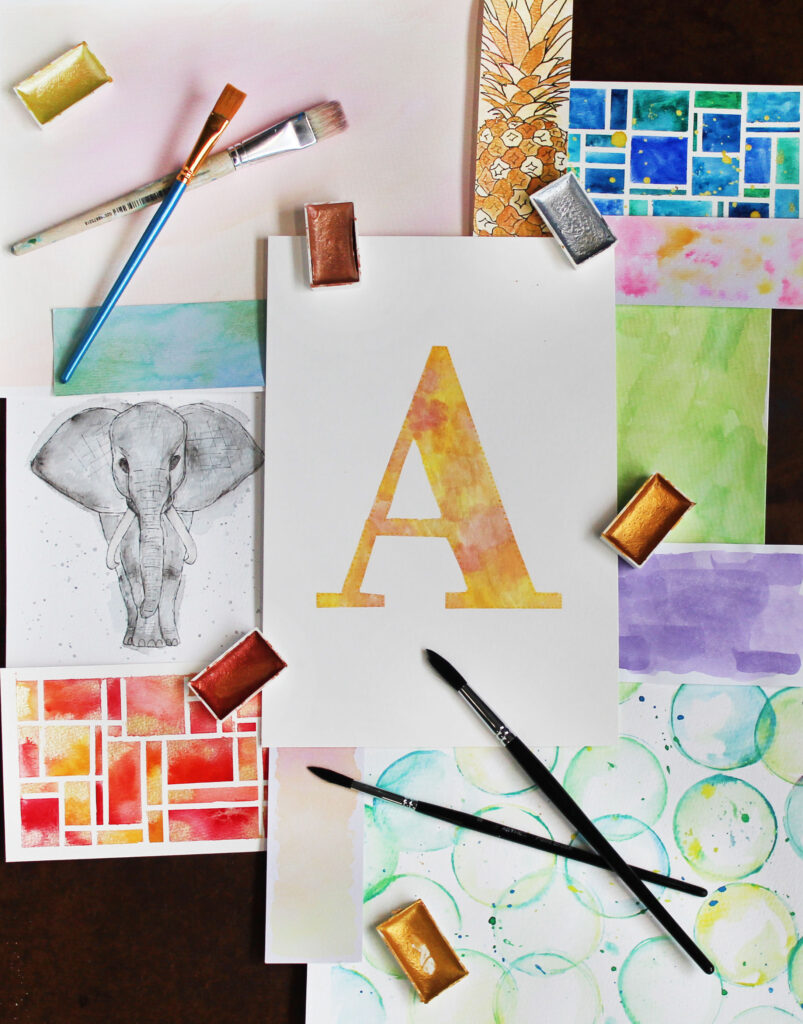
- Research: Project research I did consisted of gaining knowledge of design from two textbooks. One went over design basics, where the other one had a primary focus on color. For this poster, I focused on the first two chapters of the design book “The Elements of Graphic Design” and first few colors from the color book “The Designer’s Dictionary of Color”. From the books, I learned about the concept of space and the colors I studied were butter and coral. I used those elements and themes to create my poster.
- The Idea: My poster demonstrates these ideas and themes that I learned and shows my knowledge of design and color principles. It connects to my audience by being visually stimulating and open to interpretation.
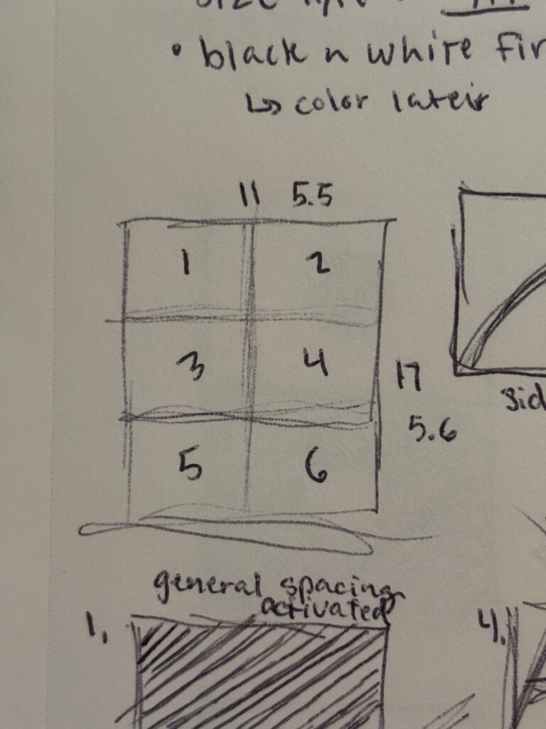
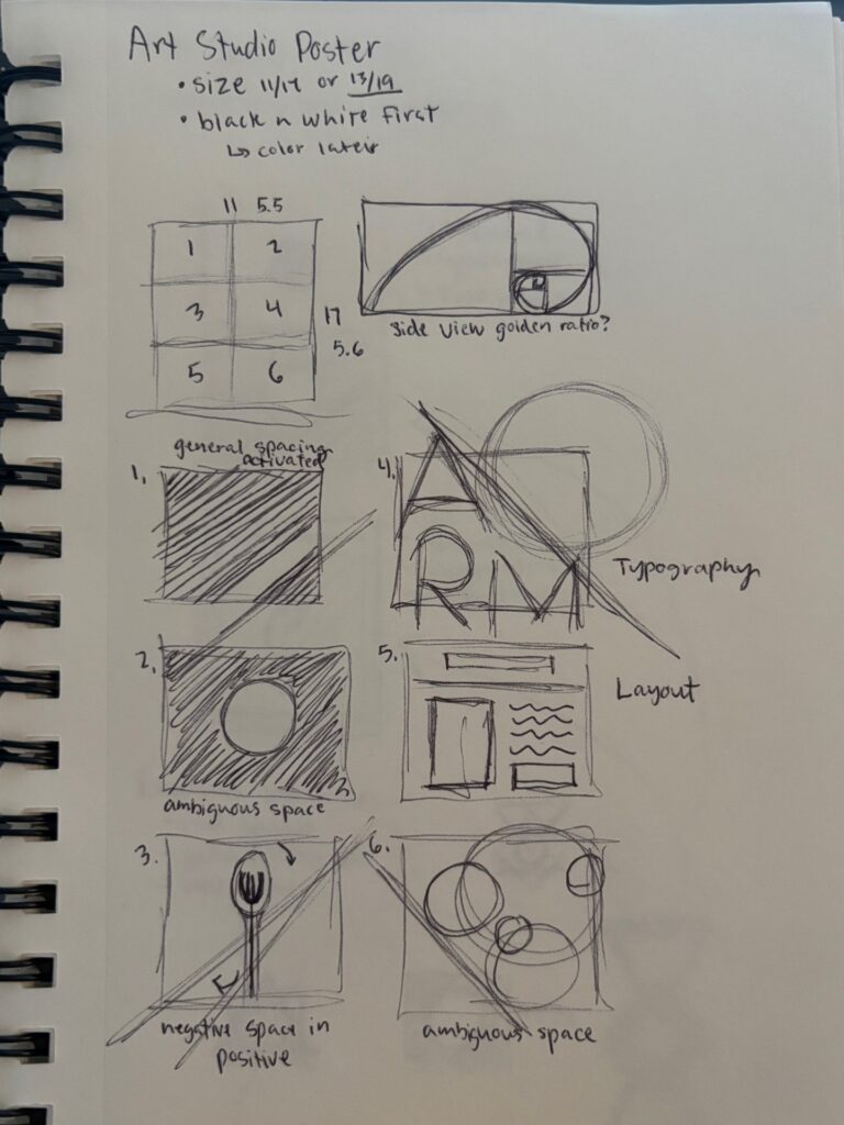
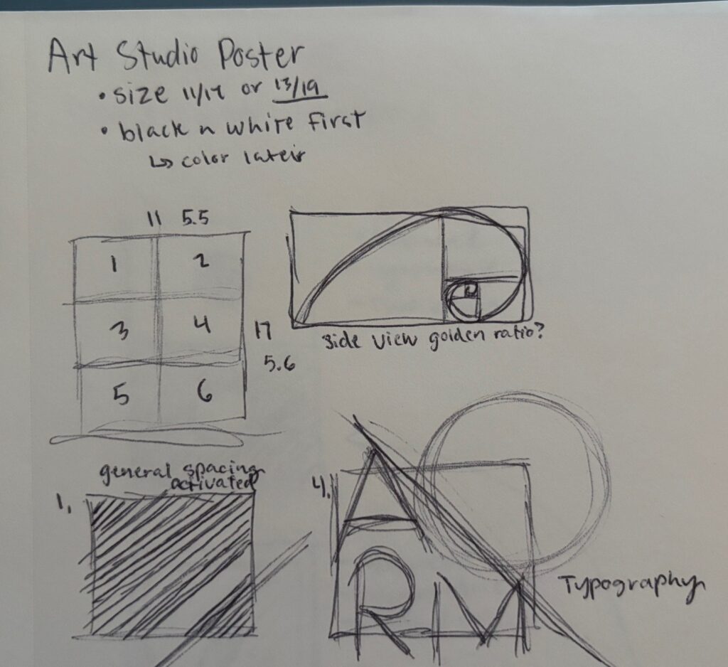
- The Thought Process: Starting out my project was to read the chapters from both textbooks. As I read, I took notes on items I found interesting or useful for in my design, like the concept of ambiguous space. After reading, I started the sketching phase. It was here that I made two important design decisions: I wanted six sections to show different space principles and that I wanted the overall design (when on it’s side) to mimic the Golden Ratio. Once done with sketching, I created my poster in Illustrator. I didn’t make many major design changes in the program besides polishing. I kept very close to my sketches.