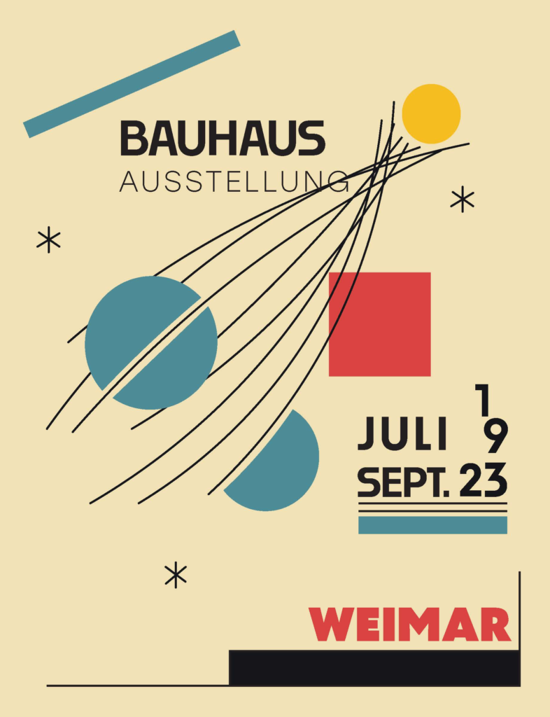
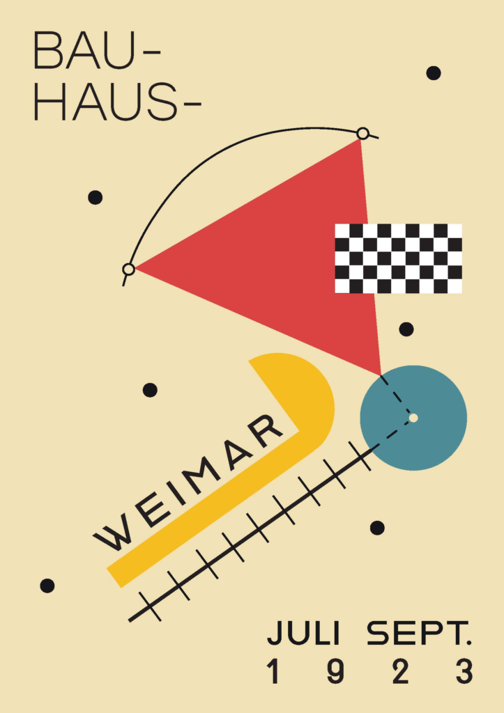
Bauhaus Postcard Series
- Description: My goal with completing this project was to learn about the Bauhaus school and then focus my study on their graphic design style. This project was an assignment where I was specifically looking at shape forms, colors, and typography.
- Design Context: The objectives for this project were to create a finished product that consisted of five postcards: two copied/recreated and three that were of my own original design that mimicked the Bauhaus aesthetic in the way of typography, simple shapes, and color. The methods decided by my professor and myself to complete this project were both watercolor paint and digital programs like InDesign and Illustrator.
- Research: I found useful information from the books “Bauhaus 1919-1933” and “Creative Typography.” However, most of my research came from the book “Bauhaus Typography at 100.” When studying pages, I learned that the Bauhaus liked to use basic shapes and colors. The Bauhaus also played around a lot with its type. All the typography I saw was in upper case. Plus, it seems the Bauhaus was not afraid to do unconventional things with its type. For example, you see that they sometimes had the type curved around an object, spaced out differently, and have the type over lay on shapes or elements that almost feel wrong.
- The Idea: My design demonstrates the themes I learned from the Bauhaus’s general principles to their specific design elements and styles. Examples of specific elements and styles are using simple shapes like the circle, square, and triangle along with only using the primary colors in their designs.
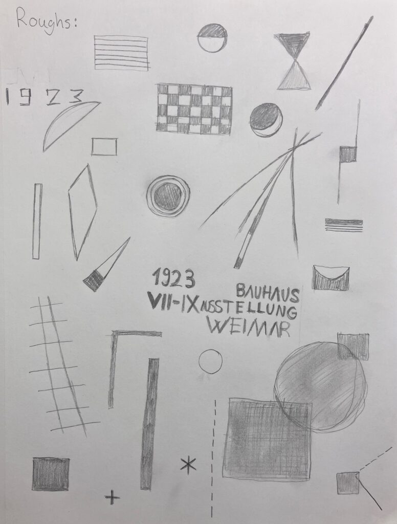
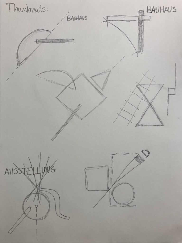
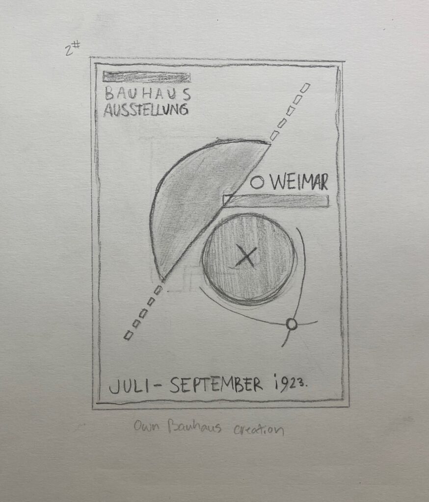
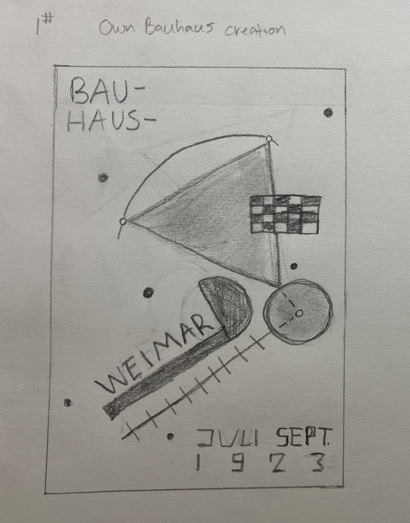
- The Thought Process: I started my process by doing research by reading and taking notes from the books I found. Then I continued with a sketching phase, making decisions, and finally executing my ideas in Illustrator. When I was making a recreation sketch, I started to fully understand how the Bauhaus thought and how they did things by going through the process myself. There is great value in that. I was also able to observe how a lot of the elements in the examples I had line up with each other. The Bauhaus was big into angles and alignment.